.jpg)
Deathmetal Logo
In Rob Scallon’s Video with the band Peeling Flesh they talk about how the ‘Slam’ genre comes out of a self aware ‘horror comedy’ approach to death metal. It...
The Minimal Mistakes Theme for Jekyll/Github Pages is great, hence why I used it to create this site, but it had one crutch which bugged me, every page layout reserved space for the author profile whether you choose displayed it or not.
In theory this is fine, you layout every page the same, with a more ‘blog style’ narrow width, but this ignores the fact that Minimal Mistakes comes with a class for extending your pages into the reserved space on the right, making your pages look uneven when your author profile is turned off.
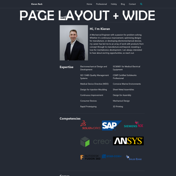
This looks bad on a webpage intended to show off your portfolio, so I sought a method to fix it, with a surprising amount of success, introducing two new layouts to the theme:
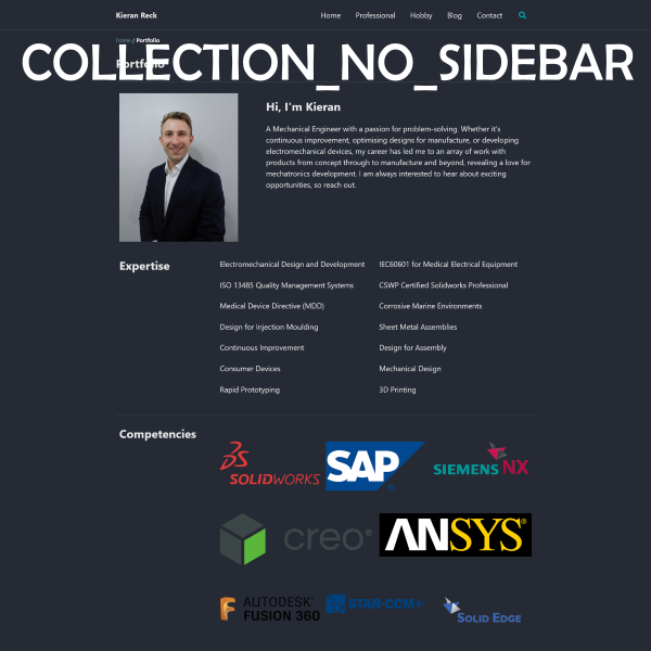
Simply call for the new layouts in the frontmatter of your page the way you usually would and away you go. These layouts pair well with classes: wide, giving your pages which span the full max width of your website structure, plus giving you a full width header that extends to the extremes of your monitor.
The frontmatter example below is taken straight from my /portfolio/ page:
---
title: Portfolio
browser_title: Portfolio \| Kieran Reck
layout: collection_no_sidebar
classes: wide
permalink: /portfolio/
collection: portfolio
entries_layout: grid
---
There are, however, a few background steps that you need to take before this will work:
Those of you who are more html/liquid savy could probably have figured out a way to do all of this using a dedicated Class, similar to classes: wide, but with this being my first attempt at these languages, I couldn’t figure this out. Here is how I got things to work instead:
The layout files are what dictate the order in which the content is structured, but the SCSS partials are what govern how your content is actually displayed on your site. There are two main SCSS partials which control the Minimal Mistakes theme, _archive.scss and _page.scss.
For my solution, I chose to modify one of these,_page.scss, giving me the ability to choose whether I want the standard ‘author profile space reserved’ behaviour, or the new ‘extended to fill the space’ behaviour.
Here are the steps to take:
_sass/minimal-mistakes/_page.scss file$right-sidebar-width, at the time of writing this, there are 6 of them. Four are right near the top of the page and two are further down..initial-content,
.search-content {
flex: 1 0 auto;
}
.page {
/* <------------------------------- this is where my modification starts
@include breakpoint($large) {
float: right;
width: calc(100% - #{$right-sidebar-width-narrow});
padding-right: $right-sidebar-width-narrow;
}
@include breakpoint($x-large) {
width: calc(100% - #{$right-sidebar-width});
padding-right: $right-sidebar-width;
}
this is where my modification ends -------------------------------> */
.page__inner-wrap {
float: left;
margin-top: 1em;
margin-left: 0;
margin-right: 0;
width: 100%;
clear: both;
.page__content,
.page__meta,
.page__share {
position: relative;
float: left;
margin-left: 0;
margin-right: 0;
width: 100%;
clear: both;
}
}
}
/*
   Related
   ========================================================================== */

.page__related {
  @include clearfix();
  float: left;
  margin-top: 2em;
  padding-top: 1em;
  border-top: 1px solid $border-color;

/* <------------------------------- this is where my 2nd modification starts
    @include breakpoint($large) {
      float: right;
      width: calc(100% - #{$right-sidebar-width-narrow});
    }

    @include breakpoint($x-large) {
      width: calc(100% - #{$right-sidebar-width});
    }
this is where my 2nd modification ends -------------------------------> */

  a {
    color: inherit;
    text-decoration: none;
  }
}

.page__related-title {
  margin-bottom: 10px;
  font-size: $type-size-6;
  text-transform: uppercase;
}
At this point, if you have any pages in your side which rely on the _pages.scss partial, they will now fill to the left into the space which used to be reserved for the author profile. Neat!
So, we have changed our SCSS partial, but what if I still want some of my pages to reserve space for the author profile? Well, my Contact page does just this!
Sadly, whilst I could figure out that it was the _layout files that dictated which scss partial was used for styling a page, I couldn’t figure out how if was being done. The layout files work in a cascading fashion, each adding their few niche elements and then linking to the next layer down, with archive.html and single.html being the two ‘final’ destinations.
flowchart LR

archive.html --> _archive.scss
single.html ---> _page.scss
collection.html --> archive.html
home.html --> archive.html
posts.html --> archive.html
tag.html --> archive.html

subgraph Layout-Files
archive.html
single.html
collection.html
home.html
posts.html
tag.html
end

subgraph SCSS-Partials
_archive.scss
_page.scss
end
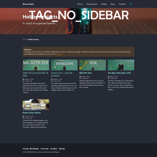
So, I took advantage of this. I created two new files, _layouts/collection_no_sidebar.html and _layouts/tag_no_sidebar.html, which are copies of their standard brethren, and changed the frontmatter in each file so that they now called single.html instead of archive.html
Old Frontmatter within collection_no_sidebar.html and tag_no_sidebar.html
---
layout: archive
---
New Frontmatter within collection_no_sidebar.html and tag_no_sidebar.html
---
layout: single
---
This updates our structure to look like the following:
flowchart LR

archive.html --> _archive.scss
single.html --> _page.scss
collection.html --> archive.html
collection_no_sidebar.html --> single.html
home.html --> archive.html
posts.html --> archive.html
tag.html --> archive.html
tag_no_sidebar.html --> single.html

subgraph Layout-Files
archive.html
single.html
collection.html
home.html
posts.html
tag.html
collection_no_sidebar.html
tag_no_sidebar.html
end

subgraph SCSS-Partials
_archive.scss
_page.scss
end
Once you have implemented the change to _page.scss mentioned above, you are free to create layouts both with and without space reserved for the sidebar. It is as simple as:
layout: archivelayout: singleIn Rob Scallon’s Video with the band Peeling Flesh they talk about how the ‘Slam’ genre comes out of a self aware ‘horror comedy’ approach to death metal. It...
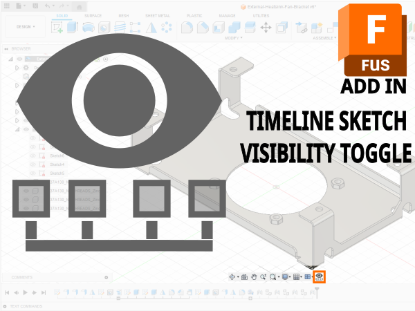
A vibe coded Autodesk Fusion / Fusion360 add in which allows you to toggle sketch visibility from a timeline or viewport selection
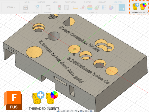
A vibe coded Autodesk Fusion / Fusion360 add-in for managing threaded insert workflows. This tool helps teams identify and mark threaded insert holes using u...
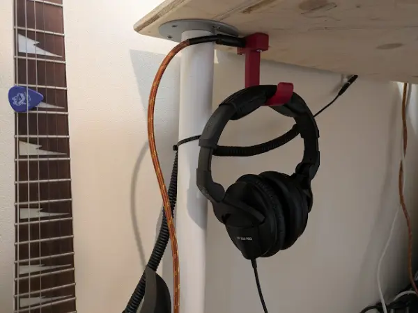
I designed a headphone hook which also provides a place to plug my guitar cable when it isn’t in use.